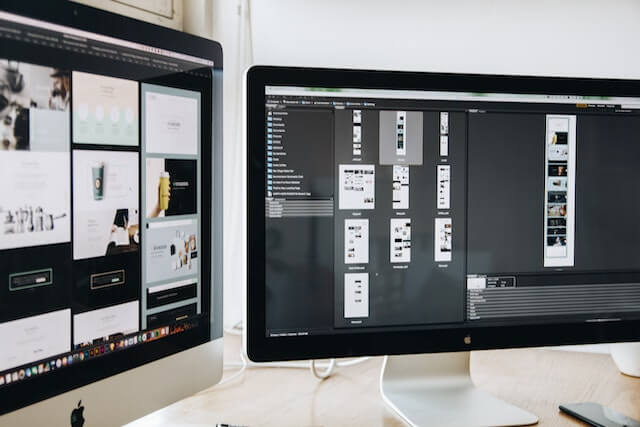
Some designers still consider font pairs and their selection as some foolish strategy. But this is about your visual-friendly strategy. Imagine that fonts can spoil your overall design solutions. It is real if you make some unusual font pair that is difficult to capture with the help of average human vision.
Your task is to make people convenient with text blocks on the website. That is why your great visual starts with win-win font tandems. Sure, you can mix fonts yourself and get a great result. Start with ready-to-use pairs and be open to experiments. The most experienced designers still learn something new and discover new approaches. This way your visualization skills can be leveled up as well.

Nevertheless, take a closer look at the top 5 font pairs loved by web designers around the world. You can complement your graphical content and make your text block easy to read this way.
5 Top Font Pairs to Consider in 2023 – Find Your Favorite for Customer-Centric Web Design
Remember that the combination of several fonts is about your improved visuals. Human sight can detect printed pieces of information easily this way. Additionally, such a design looks catchier and more customer-centric. But we speak about lucky tandems where both fonts suit each other and make some kind of a single story.

Speaking about the top-rated font pairs to consider for web design in 2023, they are ones that fit content of any type (blogs, online shops, books, magazines, etc.). Complement these font combinations with the best-matching pictures and content. You will see the difference between mono-font text blocks and your visual.
Here are the top 10 font pairs to take into consideration:
- Open Sans + PT Sans – this is a classy pair. Your texts will look well with any design solutions. It is easy to read content and navigate through messages on the web resource. We recommend this tandem for blogs with long reads. Your readers’ eyes will not be bored and tired.
- Quicksand + Source Sans Pro – if you dream about visualization where some accents take place, this is the best pair. While Quicksand will suit headlines the most, Source Sans Pro will be optimal for the main text body. Play with fonts and emphasize the most important information. The excellent match for landing pages and home pages of solid websites.
- Yeseva One + Josefin Sans – this pair is for some extraordinary vibe in web design. If you would like to improve your branding visuals and highlight your luxurious reputation, you are welcome. This tandem is for you.
- Yellowtail + Lato – the most catchy pair for designers who prefer neutral visual effects and compact scripts on the website. This tandem with bold or italic formatting looks like a friendly match that will suit personal blogs, social media posts, etc.
- Open Sans Condensed + Lora – this pair is about professionalism and brand identity features. If your website should look like a well-respected brand book, take a closer look at this tandem. Additionally, this font pair looks with formatting – texts become gorgeous. You can use this visual solution for product pages to make them catchier.
Final Word
To sum up, there are many other font combinations to take into account. Nevertheless, you can start with these multipurpose tandems and improve your website visualization properties. UX design is impossible without the great performance of text blocks and their harmony with other graphic elements. To integrate content well, these font pairs can help.
